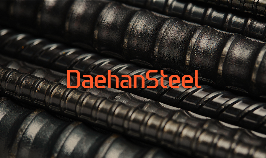
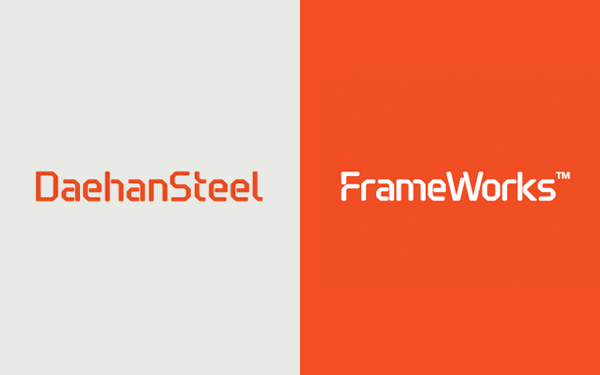
Daehan Steel, one of the three major steel company in Korea, reformed its company brand and solution brand in creative partnership with JOH&Company. The company also published Frame Book that tells about the essence and vision of steel manufacturing industry and the past and the present of Daehan Steel. JOH had examined the brand state and system of Daehan Steel, reestablished company brand’s identity and directed the launching of the solution brand ‘Frameworks’ and publishing project of the ‘Framebook’, the brand book of new format since November 2013.
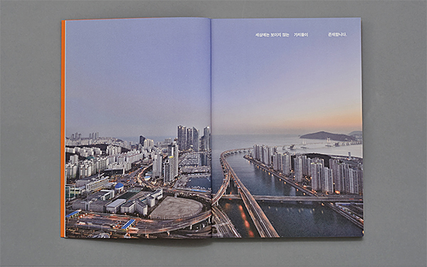
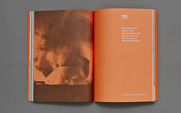
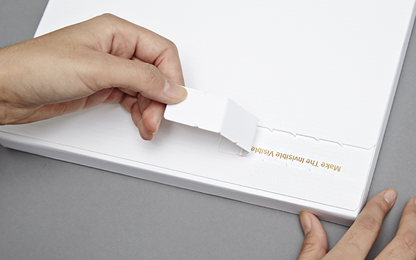
Values found in the invisible
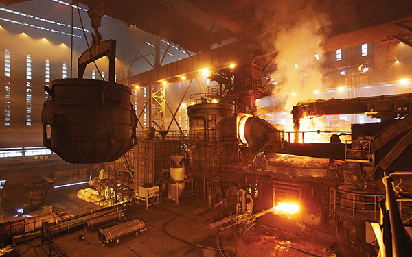
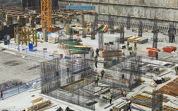
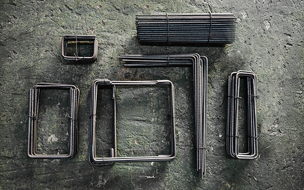
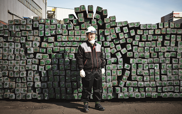
Daehan Steel, one of the three major steel company in Korea starting from a small hardware store in Busan since 1954, started producing the highly efficient coil steel reinforcement first in the nation and have exported it to Australia and Singapore as well as built the direct steel reinforcement manufacture system to establish the biggest steel reinforcement manufacturing network in Asia.
Evaluating its 60 years of history and beginning to prepare for the competition in the global market, Daehan Steel consulted with JOH for the ‘Brand diagnosis and prescription unlimited to the duration and scope’. The CEO himself decided to entrust the examination of the brand state and system of Daehan Steel and the reestablishment of company brand’s identity project to JOH.
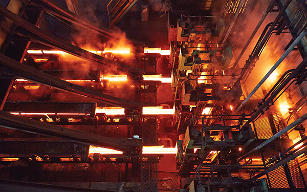
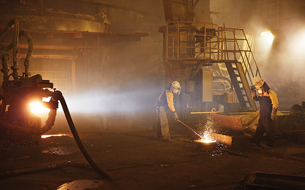

In 2010, Daehan Steel launched a new brand Staz, meaning ‘A to Z of steel solution’, to analyze customer need throughout the supply process and to provide optimized solutions for each site. Staz solution received favorable responses from construction sites in spite of the continued recession in construction industry and helped the company leap ahead to be the nation’s number three steel company. However, problems aroused as the customers simply took the brand Staz as a rebar manufacturing service or failed to connect the brand with Daehan Steel: in the process of active promotion to enhance the awareness of Staz solution, the Staz brand itself had been put before the established assets of corporate brand.
The way of work establishes the brand
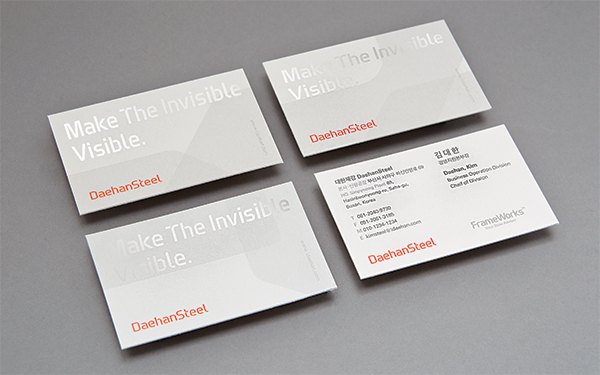
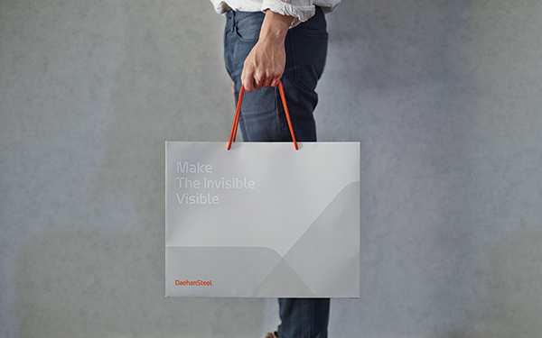
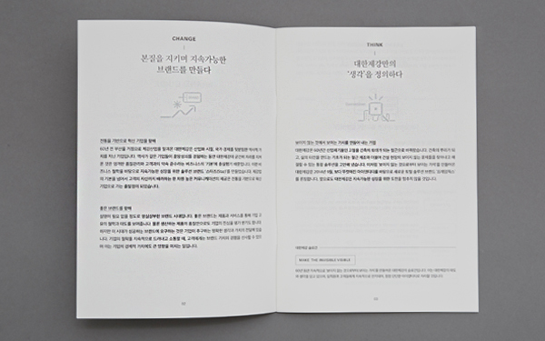
JOH began from solidifying the brand identity of the company with 60 years of trust and professionalism. After conducting numerous interviews and workshops with executives and staffs from the headquarter office, branch offices at home and abroad, partner companies and client companies, JOH perceived the philosophy, value orientation and work procedure of the company with clarity and defined its four core values as Optimizer, Advisor, Creator, and Explore. The nature of steel manufacturing industry and the company’s will to innovate are embodied in the brand slogan ‘Make the Invisible Visible.’
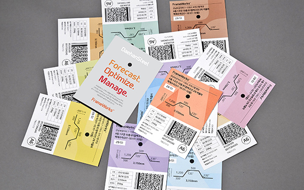
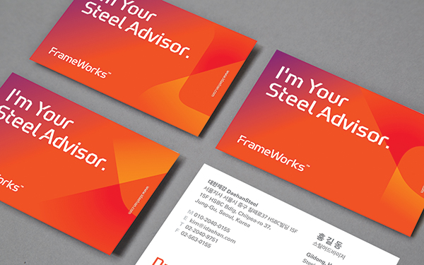
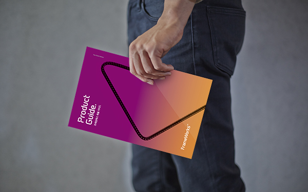
As problems related to its name and message conveyance were pointed out in the existing Staz solution, the process was reformed based on the three axis of Forecast, Optimize, and Manage. Its new name and visual identity, Frameworks, aspires to be the integral solution that provides more professional consulting service in the global market.
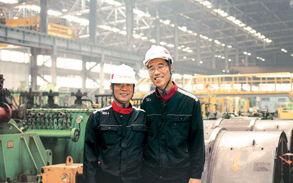
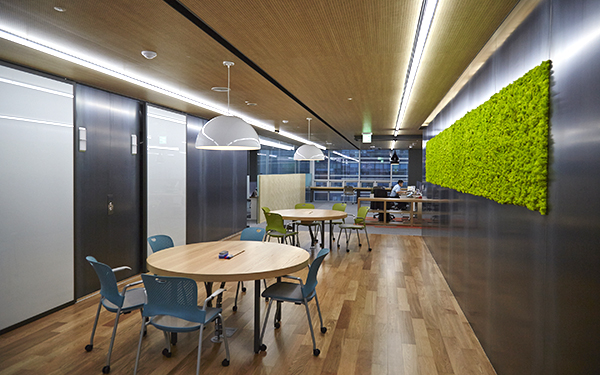
Daehan Steel has been operating an internal taskforce team, which is quite rare in steel manufacturing industry, to enhance the company’s brand awareness. JOH’s prior concern in designing new corporate identity of the company was to enable the internal taskforce team to manage and maintain the coherent identity with minimal investment after the partnership project is over.
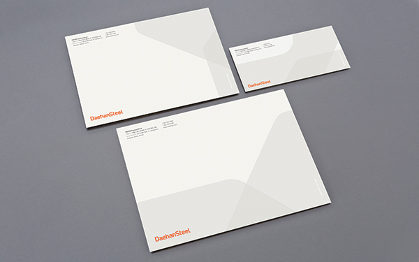
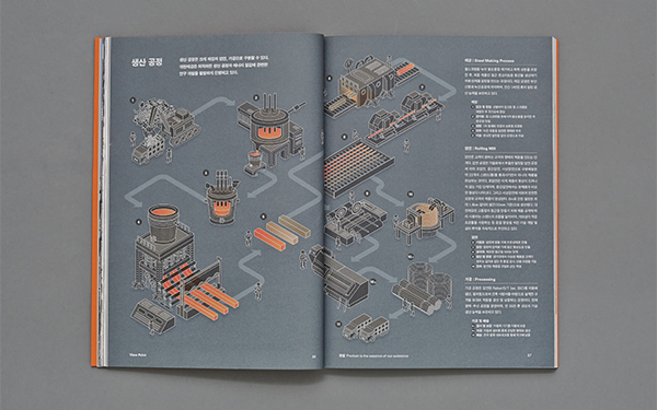
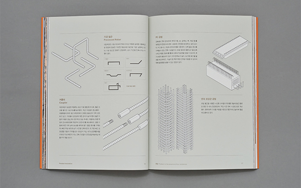
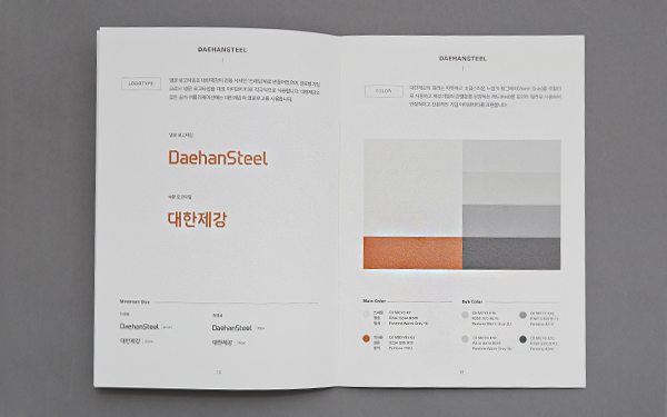
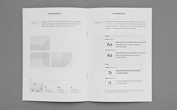
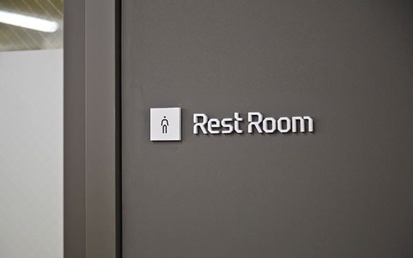
The graphic motifs and design principle were also developed to meet the standard of ‘coherence’ and ‘expandability’ that is quickly adapted in any construction site. Rather than developing new designs for each product or site on limited resources, JOH developed a modulated types and design system that deliver coherent brand messages.
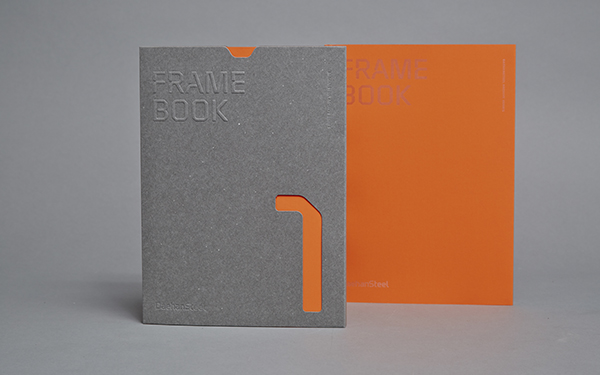
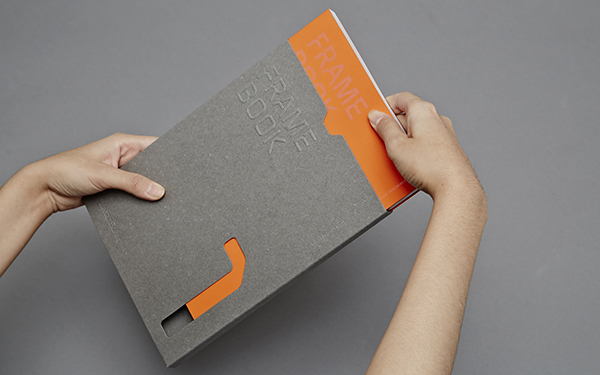
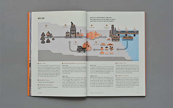
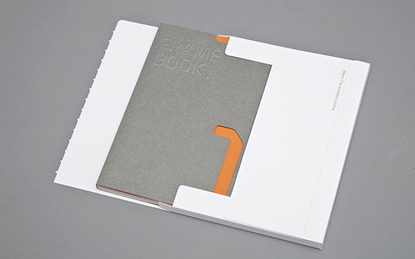
Celebrating the company’s 60th anniversary, Frame Book was published to introduce Daehan Steel’s new brand identity with living voices of executives and staffs of the company. The nature of steel manufacturing industry, the innovation of solution brand, and the history and vision of the company with its 60 years of history are put into its five chapters: Circulation, Essence, Necessity, Innovation, and Root. Frame Book is not only an archiving or promoting material, but also plays an important role in ‘internal branding’ that reconfirms the philosophy and vision of the company and shares them with every stakeholders inside and outside the company.
The interview below was conducted with Daehan Steel team (D) and JOH team (J) participated in the branding project.
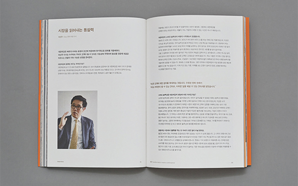
Rare times we see a steel manufacturing company invest much in branding.
J) Daehan Steel is a company that has been successfully innovated and differentiate itself with competitors in the industry, rather than unknowingly staying in the market after surviving through 60 years of competition. The company chose to focus on the practical needs and awareness of the customers instead of expanding the scales and range of the business. Naturally they began to pay attention to the brand identity of Daehan Steel that differentiates the company from any other. The company owner’s insight and will also played an important part of the innovation. In cases of steel manufactures overseas, many has strong brand identity and competitive product/solution design methods equivalent to those of design agencies. Daehan Steel had found a role model from those cases and has been working with outstanding creative partners.
Was there a difference this time, compared to the prior projects you’ve done?
D) The partnership was the crucial difference: rather than merely doing appointed tasks on request, JOH shared their thoughts with us until both of us come to an agreed conclusion. In every project workshop, the members of JOH team told us that the results were not entirely invented by them, that the ideas had long been resided our company and they just elaborated them for us. As a person in charge of the project, their way of thinking made me feel responsible and empowered as well.
The Frame Book seems quite different from other corporate history books.
J) To overcome the graveness and rigidness of corporate history, Daehan Steel had been experimenting with its history book since long before. For example, they had tried spiral-bound ones that looked fresher and friendlier than the thick, stubborn-looking hardcover books. Yet these books maintained the common mistakes found in the corporate books filled with self-praise and admiration in the company’s point of view. It is sad when a book written with such effort is forgotten after being read by limited numbers of readers inside the company. Thus, the basic direction of the Frame Book was to maintain objective perspective on the company with JOH as its editors, as well as to extend its range of readership to include those who are not familiar with Daehan Steel and the steel manufacturing industry.
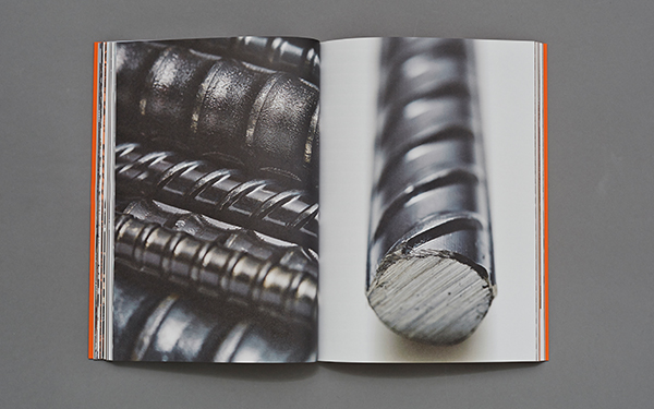
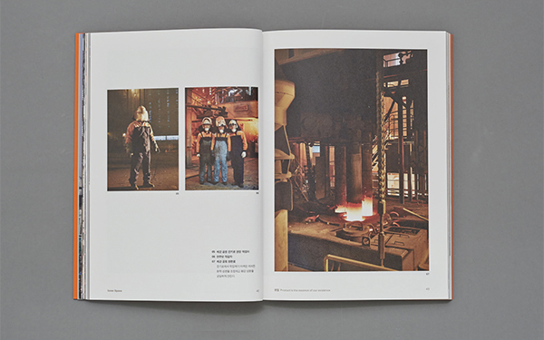
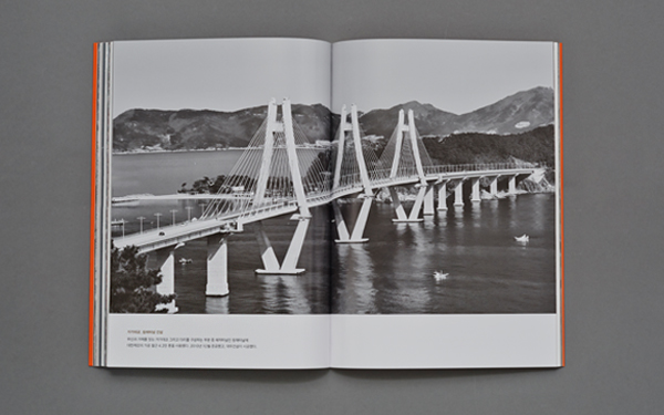
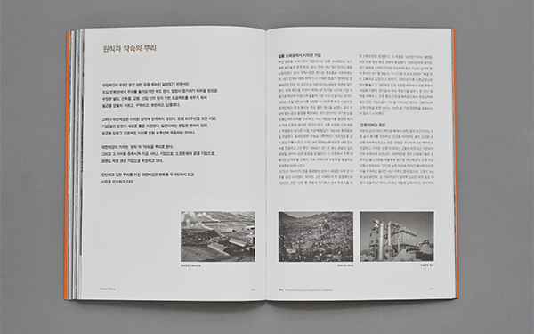
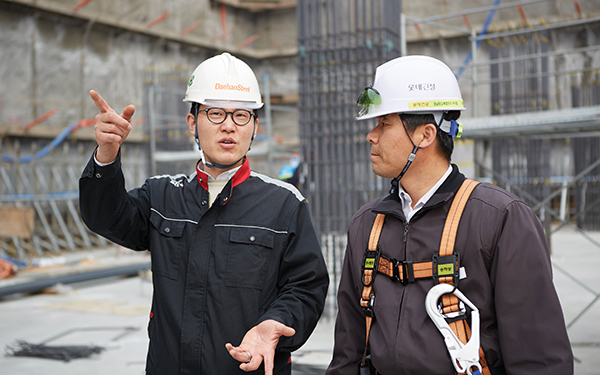
D) Frame Book has a chapter which introduces buildings built with rebar provided by Daehan Steel. We had visited an elementary school in Hoengseong County of Kangwon-do to take photoshoots of the school building for that chapter. The school, established in 1949, was reconstructed in 2009 using 24 tons of rebar. Although amount of rebar used in the school building was tiny, compared to that of fancy office buildings or large-scaled civil construction plans, we tried to deliver the message ‘we have our rebar everywhere in our lives, and people inhabit there,’ with the photography of the building. The editorial process itself once again reminded us of the importance of archiving our works. Beginning with the publication of the Frame Book, we’ll continue to archive what we are and we’ve done and share them with more people.
I assume that the steel manufacturing industry was an unfamiliar field to JOH.
J) We’ve been working for construction or chemical industries, but working with steel manufacturing company was totally different experience. In our first project meeting with Daehan Steel team, we said, ‘maybe we can come at it as if we’re planning for another issue of Magazine B, covering Daehan Steel this time.’ We tried to learn from Magazine B’s ways of building relationship with a brand, and these efforts were combined in one book called the Frame Book.
It’s interesting that you approached this project with the perspective of magazine editors.
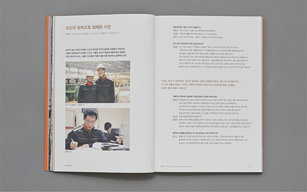
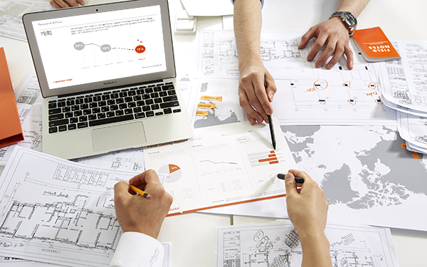
J) Just as we do with Magazine B coverage, we took objective point of view and researched and archived the story of those who work for the company, the nature of the industry, its driving force for innovation, its history and vision in multiple perspective. With the headquarter office in Busan and branch in Seoul as the center of our attention, we visited the company’s plants and construction sites around the country. We also met staffs from branches in Singapore and Vietnam and even contacting persons from its partner and client companies. The extensive research in the early stage of the project helped us re-establish the corporate and solution brands with sound basis.
D) We realized that the interviewees was willing to participate, shared their opinions and actively engaged in the discussion. We were glad as none of them seemed to participate reluctantly or half-heartedly. The interview process was a great chance for us to listen from our employees working in branches all across the country.
Please tell us how the project affected the company, and share some plans for the company’s future.
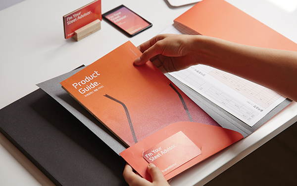
D) Thanks to the project, we now have a story that can be shared internally as well as outwardly. Frame Book is the most efficient way to demonstrate what we are and what we do, since the contents of the book range from the very definition of steel manufacturing to the future visions of the company. Also, the design works just got easier after we got the clear design guidelines for the corporate and solution brands.
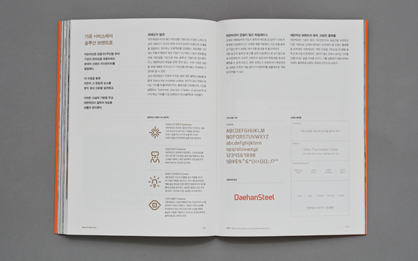
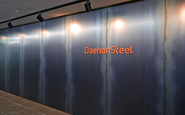
Now our promotion team have tons of works to do: we are promoting lots of internal activities to help our employees get familiar with the new designs, while modifying and rearranging existing contents according to our new brand identity. The Frame Font is being actively used inside and outside the company: starting from the business signs in the new office of Busan branch opened in last September, signboards our factories and branches are being replaced with new ones with Frame Font on them. These new typeface and graphic motives are highly versatile and adaptable in many situations; they are expected to improve coherence in realizing design identity from now on.
- PROJECT OWNER
- Daehan Steel
- CREATIVE DIRECTION
- JOH&Company
- BRANDING
- Project Management – JOH&Company, Public Relation Department of Daehan Steel
- Brand Platform Development – JOH&Company
- Visual & Verbal Identity Design – JOH&Company
- Application Design – JOH&Company, Public Relation Department of Daehan Steel
- Typeface Design – JOH&Company
- Pictogram Design – HAM YoungHoon
- Website Design & Development – D.FY
- Space Planning & Design – OJ Design
- BRAND BOOK PUBLICATION
- 진행 – Public Relation Department of Daehan Steel, JOH&Company
- Creative Direction – JOH&Company
- Editorial Design – Frame Builders
- Photograph – Park Sunghoon, Kim Yoon, JOH&Company
- Illustration – Park ByungMin, Choi OokHwan
- Proof Reading – Shin SeoKyung, Nho HyeRi
- 자료 제공 – 부경 근대사료연구소
- 인쇄 – TOP Process
- Translate
- Translate – Byeol Song