Project Owner: Maeil Dairies
www.maeil.com
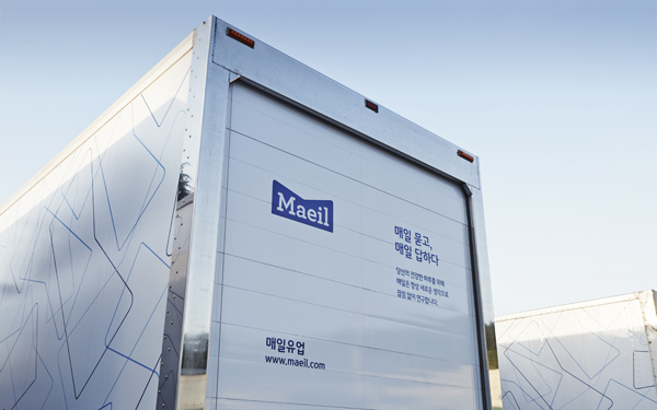
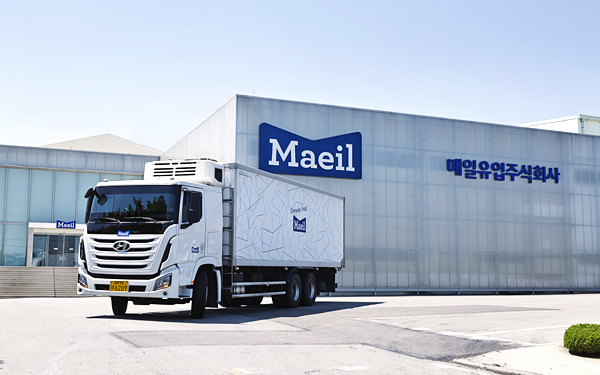
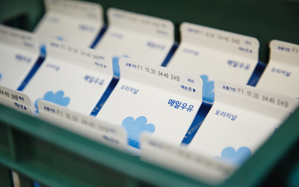
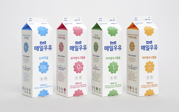
In October 2014, Maeil Dairies have introduced a new line of low fat milk products applying new corporate identity and brand design of Maeil Dairies, and unveiled an ad campaign with a brand film for the low-fat milk. Through the partnership with Maeil Dairies, JOH & Company has been working on rebuilding the corporate brand of the dairy company and incorporating the identity of scattered product brands in accordance with the business strategy, the new CI and Maeil Milk introduced this time being its first outcome.
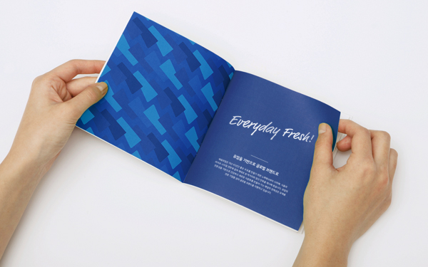
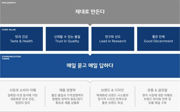
Selected as the communication theme of Maeil Dairies’ corporate brand through the consulting of JOH, “Ask Everyday and Answer Everyday” captures the philosophy of the owner and shared values of the staff. The theme becomes the starting point to deliver Maeil’s perspective and attitude by conveying the authenticity of the dairy company devoted to research and making countless attempts to achieve a healthy everyday of consumers, overcoming the limitation of “fresh food” perceived in the minds of consumers.
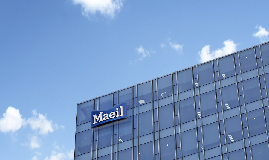
Going through this CI rebuilding process, led by the owner and followed by company-wide attention and participation, Maeil has gone one step further from just changing its logo and design. It has reaffirmed its philosophy and essence of the company’s identity, applied the shared values to its operational processes and worked on making the new brand and design known to its consumers, becoming the corporate identity renewal case in the truest sense.
JOH & Company is in charge of brand management and creative design for all the brands of Maeil Dairies based on the long-term partnership with Maeil, and is continuing to develop brand system and design concept which will enable Maeil to run its product brands efficiently and build its assets not only in the domestic but also in the global market. Apart from the CI rebuilding and Maeil Milk brand design, the two companies are going to apply brand concept and design to various product brands such as fermented milk products and other beverages in due order.

What led to the renewal of the corporate brand of Maeil Dairies?
Under the vision of “top healthy company as partner of our consumers,” Maeil Dairies has so far adhered to the design style emphasizing clean image by adopting the color and symbol visualizing “freshness.” However, in the minds of consumers, “Maeil” has been confined to the image of “milk”, and it was hard to gain a competitive edge and discriminate Maeil from other companies. Maeil Dairies already had a variety of competitive products and was about to expand into the global market such as in China in earnest. The purpose of the renewal was to continue the entrepreneurial spirit based on Maeil industry and to equip them with the identity system to have them better prepared for upcoming challenges and competition against global competitors.
What aspects of Maeil Dairies have you focused on?
We have had a long conversation with the top management, executives and staff members of Maeil Dairies. From the marketing point of view, products such as milk and fermented milk are usually called low-involvement products or commodities but the approach of the owner, executives and the staff toward their products was different. Sharing the philosophy of “Make things the right way,” they were striving to provide products consumers want using quality ingredients at reasonable prices. They did not allow negative strategies against their competitors or making imitated products conscious of competitors because they had this belief that eventually it will only make everyone suffer. JOH thought that it is better to communicate based on Maeil’s “authenticity”, i.e., their attitude toward its products and the industry rather than on the value of being recognized as “fresh.” The theme, “Ask everyday and answer everyday” is the manifestation reflecting the change in their perspective.
What was the reaction of Maeil Dairies staff to the identity renewal?
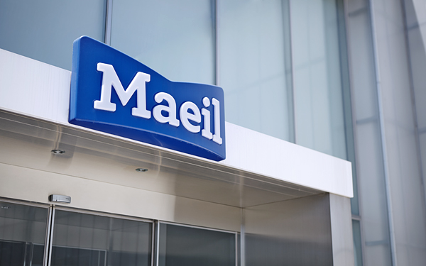
Indices so far have indicated that Maeil had quite high brand awareness but it did not necessarily mean that it had a clear brand image or most preferred by consumers. Marketing staff also felt the same way about this and shared the view that Maeil needs to strengthen the brand endorsement effect. In the course of rebuilding the corporate identity of Maeil Dairies, JOH thought it is important to represent “classicness” that inspires trustworthiness and “strength and novelty” of market leading brand. Brandmark design, slogans, core values and communication theme have been made in the same vein. Many say that the new CI is more powerful and draws more attention.
What changes have been made to the new lines of Maeil Milk products?
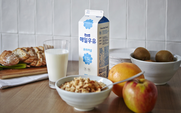
Milk is still what best represents Maeil Dairies. Generally, if milk contains 3% or more butter fat, it is called whole milk and if it has 2.6% or less butterfat, it is low-fat milk. It is nutritionally encouraged to consume low-fat milk from 2 year olds and onwards and the sales volume of low-fat milk is considerably higher in countries such as the U.S or Europe where dairy industry is more advanced. Consumption of milk is gradually decreasing with many different kinds of dairy products being introduced in the market, but Maeil Dairies have focused on low-fat milk, increasing choices for consumers. Through the renewal this time, Maeil Dairies has put forward Milk brand while making refreshing changes to the design while maintaining the existing image. Maeil has launched low fat and original milk (2%, 1% and 0%) and indicated the fat content and nutrition information in a consistent manner so that consumers can easily check the characteristics of products while paying attention to the color and graphics.
Are you also involved in working on products other than Maeil milk and the corporate brand of Maeil?
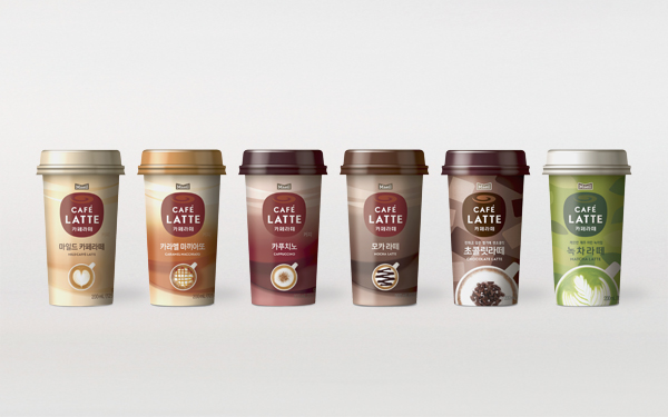
We manage corporate brand as well as design and branding for all brands of Maeil Dairies. JOH & Company directed the launching campaign of Sanghafarm Milk as well as the renewal of brand/design and advertising campaign of Café Latte. At the moment, we are examining and renewing or incorporating various brands including fermented milk or juice according to Maeil’s business strategy. Maeil Dairies’ CEO, Kim Jung-wan not only has an eye for design and brand but also a clear philosophy on how to bring about the best results when it comes to creative work. Maeil Dairies and JOH & Company, as partners, are working together on various projects, discussing the entire processes from strategy and design that maximize product strategy to consumer communication and internal branding from the brand’s point of view.
What is next for you?
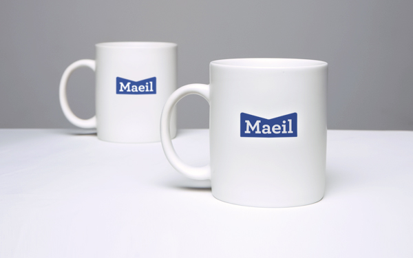
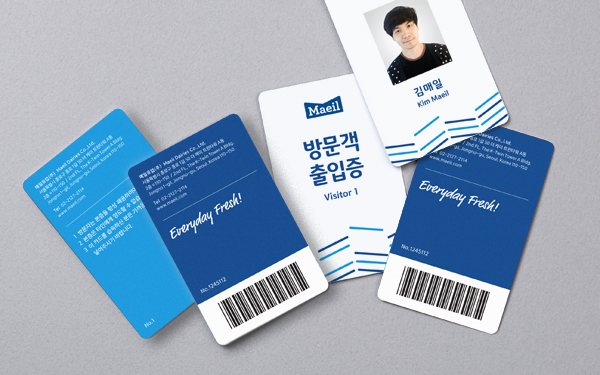
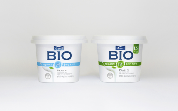
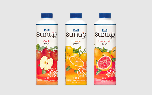
We are devoted to making the new CI and design concept known within and outside of the organization. We are checking on elements that could be the major points of contact in branding: from office space, production facilities, promotional materials to merchandise as it is important to distinguish where to put more emphasis and where less. We are working on completely renewing the product design concept of Maeil Bio, fermented milk and Sunup, cold drink among Maeil Dairies’ product brands. JOH & Company also runs various F&B brands of its own such as Ilhochic, Second Kitchen and Tribar. Partnership with Maeil Dairies provides us an opportunity to combine our know-how on running F&B brands and to experience branding in the retail market where it is much closer to consumers. We think that a new business may be created by combining JOH brands and creativity along with the product competitiveness of Maeil Dairies in the future.
- Project Owner
- Maeil Dairies
- Project Management
- JOH&Company, Marketing Support Team of Maeil Dairies
- Creative Direction
- JOH&Company
- Brand Platform Development
- JOH&Company
- Corporate Identity Design
- JOH&Company
- Brand Communication Concept
- JOH&Company, Old and New(Orewasae)
- Product Brand Identity & Package Concept Design
- JOH&Company
- Package Design
- JOH&Company, Future Design, Maverick, Brand Hotel
- ADVERTISING
- JOH&Company, Cheil Worldwide Inc.
- TYPOGRAPHY DEVELOPMENT
- Yoon Design Group
- TRANSLATE
- Eunjung Lee